
Ranking the NBA logos
Who takes the top spot
October 8, 2019
10. New Orleans Pelicans: The New Orleans Pelicans secured the final slot for best NBA logo. Their logo shows a confident pelican with its wings spread, seemingly guarding a basketball. It also has the fleur-de-lis, a symbol that means a great deal to the city of New Orleans at the top above the arched print.
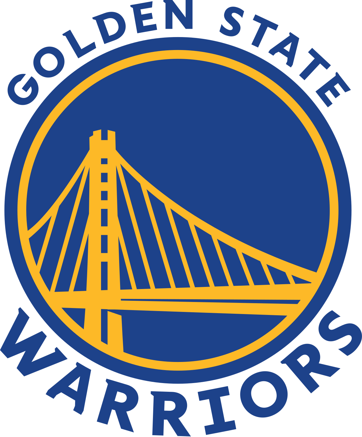
9. The Golden State Warriors: The Golden State Warriors have been a force to be reckoned with in recent years. Their logo shows the Bay Bridge in a bold golden yellow hue with a deep blue font and background. This logo received some very slight modifications for the upcoming 2019-20 season. The color has a slightly darker tone and the bridge has added details. Overall this is a solid logo.
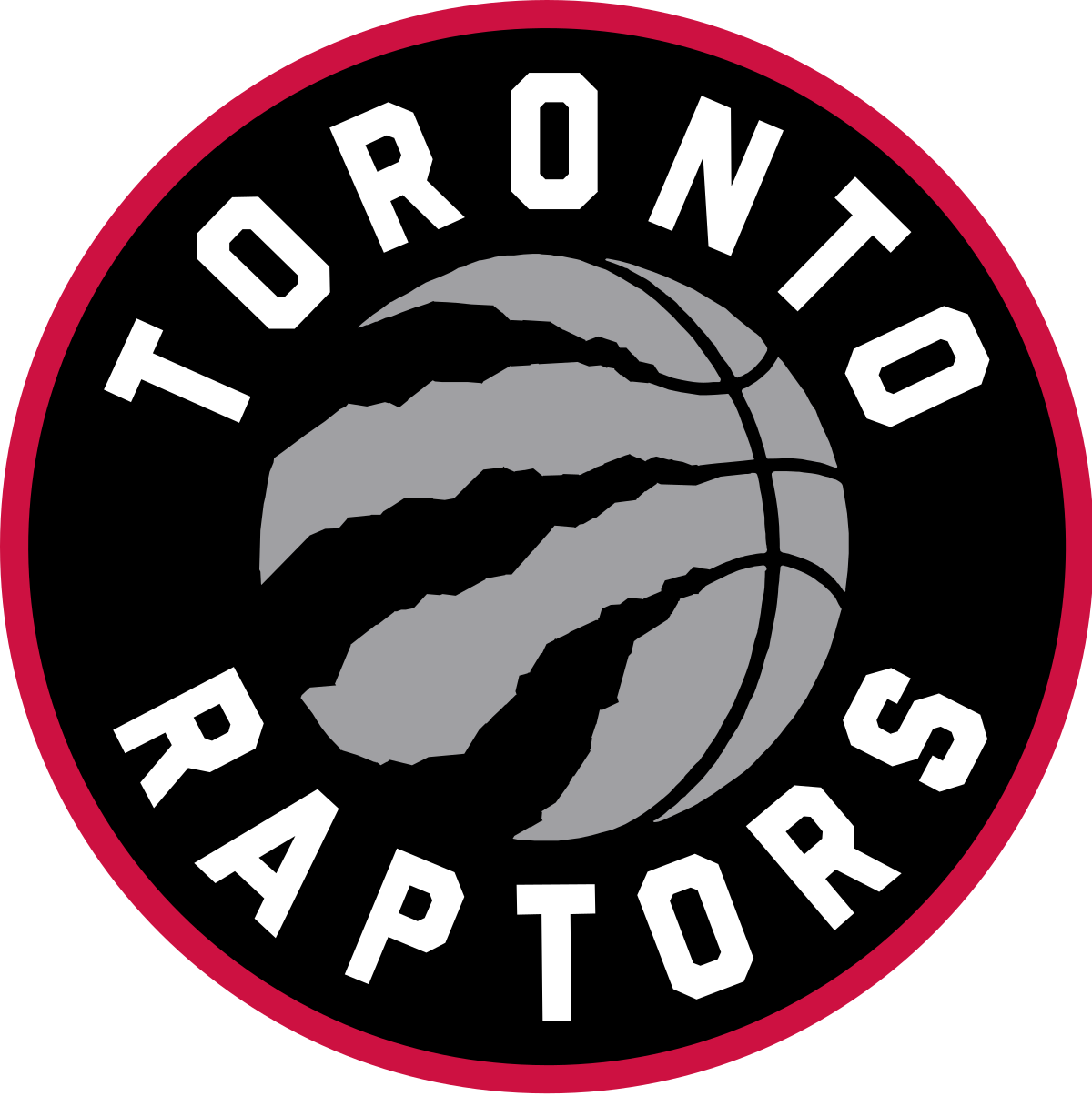
8. Toronto Raptors: The Toronto Raptors made the cut despite having a logo that is essentially just a basketball. There is something endearing and unique about the black claw marks on the silver basketball. In 2015-16, the team took a different direction and switched from the slightly cheesy raptor dribbling a ball to this cleaner, more modern design.
7. San Antonio Spurs: The Spurs’ basic-yet-effective logo secures them the No. 7 spot. Their logo was simplified for the 2017-18 season. This simplification made quite the difference, proving that sometimes less is more.
![]()
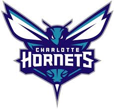
6. Charlotte Hornets: Securing the No. 6 spot, the Charlotte Hornets possess a clean logo with a creative touch. The hornet’s lower body looks like a basketball and has its stinger on display for the ultimate intimidation factor. The color palette for this logo is also a key component to its appeal.
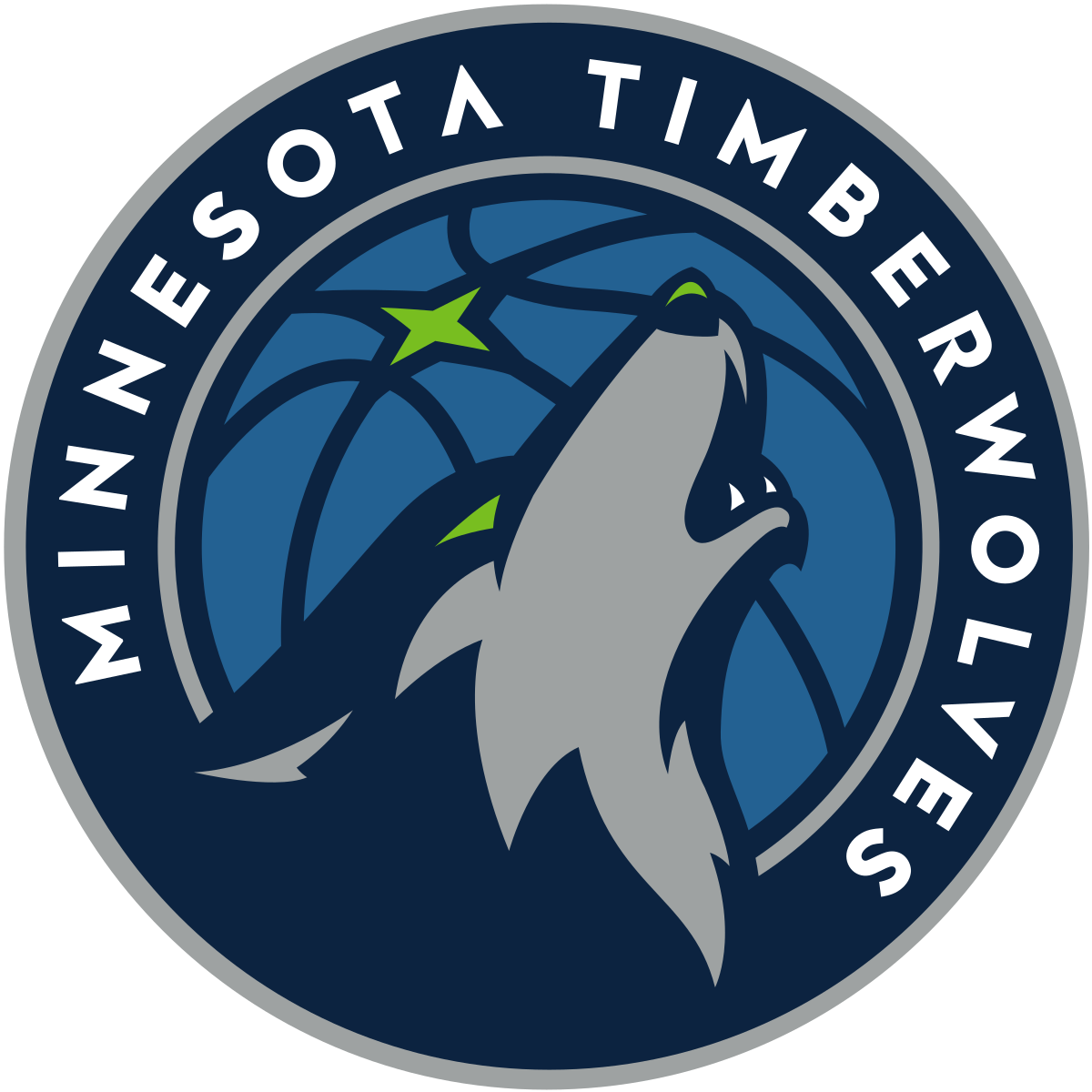
5. Minnesota Timberwolves: The Minnesota Timberwolves have a bold, appealing logo that displays a mighty wolf howling at the moon for all of the league to hear. The Timberwolves logo got a revamp for the 2017-18 season that has made them stand out from the rest of the field.
4. Memphis Grizzlies: The Memphis Grizzlies logo features another menacing animal. Complemented by an elegant font, this bear looks menacing and tough. This logo received a slight update for the 2018-19 season and though the effect was subtle, it was also effective.

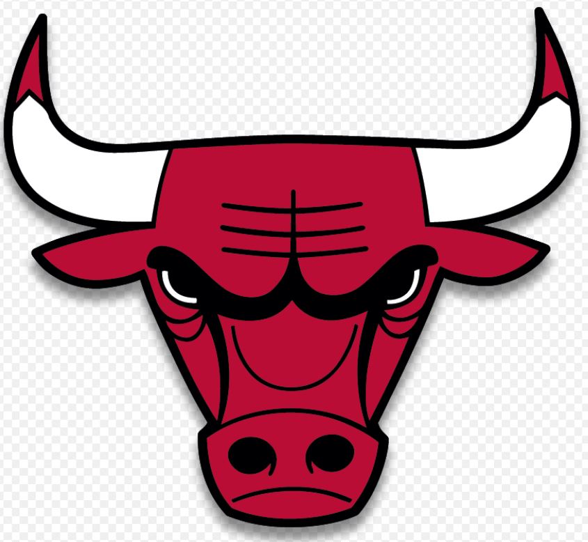
3. Chicago Bulls: The No. 3 spot goes to the Chicago Bulls, another team with a timelessly iconic logo. The Bulls’ logo undoubtedly has the “it” factor that many others lack. It is a logo associated with greatness. The Bulls have had this logo since the 1966-67 season, making it a true classic. It also doesn’t hurt that it’s aesthetically pleasing.
2. Milwaukee Bucks: The Milwaukee Bucks clinched the No. 2 spot for best NBA logo. The Bucks stepped up their logo game for the 2015-16 season. This logo is fierce, menacing and clean. The mean buck on their logo looks ready to charge at any opponent in its way.

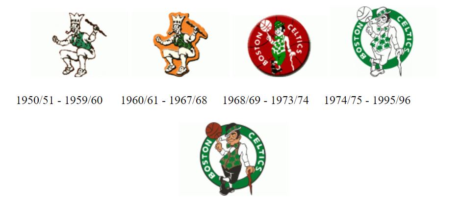
1. Boston Celtics: The Boston Celtics take the No. 1 slot for best NBA logo. With whimsical character and timeless charm, the Celtics logo is a classic representation of NBA greatness. Since 1950, Lucky the Leprechaun has been a key component of the Celtics logo. At the start of the 1960s, a slight alteration was made to the Celtics’ logo. After winning nine NBA titles, the Celtics decided it was time to show that Lucky is a true basketball star. In 1968, the first logo featuring a modern version of the Lucky was introduced, displaying an effortless spin of a basketball on his index finger. The current logo features Lucky the Leprechaun nonchalantly spinning a basketball on his finger while he leans on his cane and smokes his pipe, flashing his opponents a cheeky wink.